
The Sign Maker: Beautiful House Signs, Memorial Plaques, Wedding items, Wheel Covers & Business Signage
How to Create a Professional Signage Scheme for Your Business or Estate: How to Create a Professional Signage Scheme for Your Business or Estate
How to Create a Professional Signage Scheme for Your Business or Estate
Date Added: 07/10/2026 @ 10:01am
Good signage does far more than tell people where to go. Across a business, estate, visitor attraction or larger site, signage becomes part of the overall identity of the location.
From the entrance sign that creates the first impression to directional fingerposts, information boards, door signs and wayfinding signage, every sign should feel as though it belongs to the same family.
Creating a professional signage scheme is about finding the right balance between branding, consistency, practicality and the character of the surroundings.
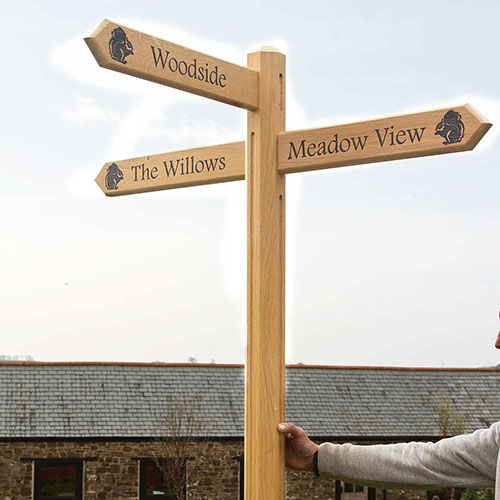
Start With Your Brand
One of the first things to consider is how your existing branding can be translated into signage.
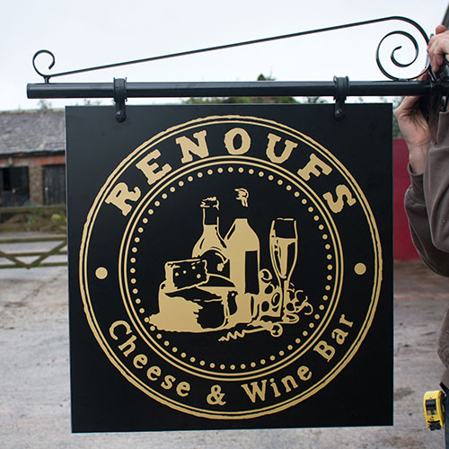
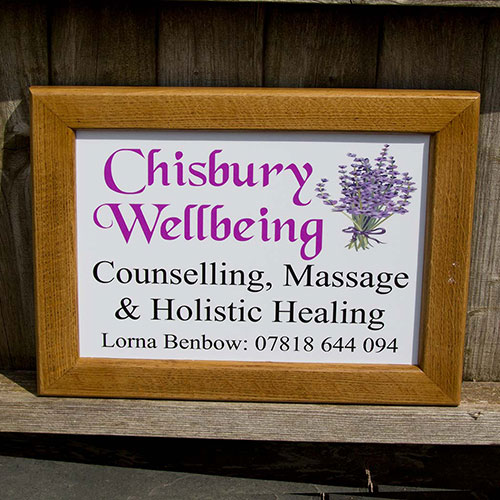
Your logo, colours, fonts and overall visual style provide a useful starting point, but signage doesn't necessarily need to replicate your branding exactly. Instead, these elements can be used to create a recognisable visual identity across the site.
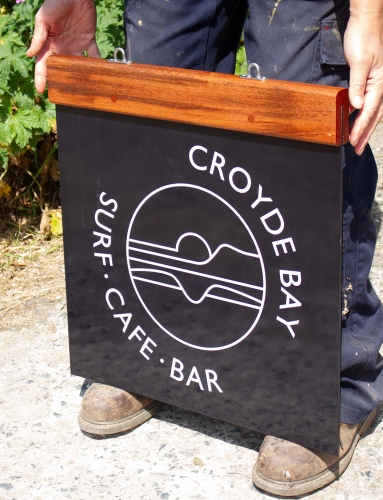
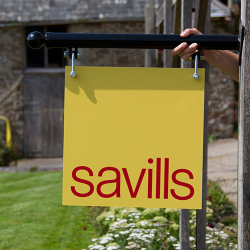
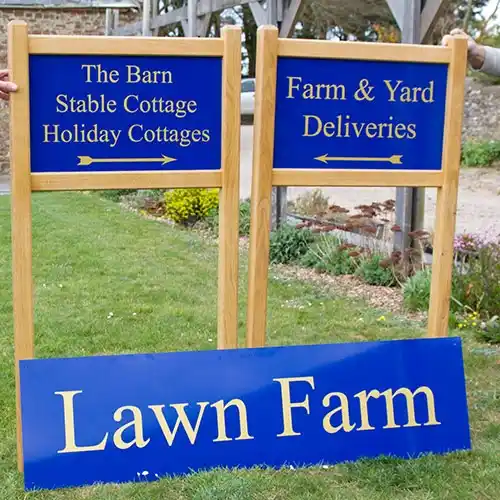
For example, a business with contemporary branding may choose clean fonts, simple layouts and materials such as aluminium or acrylic. A country estate, farm shop or rural visitor attraction might incorporate its brand colours into traditional timber signs to create something that feels appropriate to its surroundings while remaining instantly recognisable.
The aim is for visitors to see a sign and immediately associate it with your business or estate.
|
|
|
|
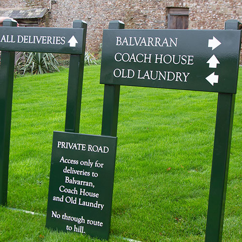
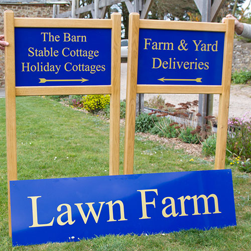
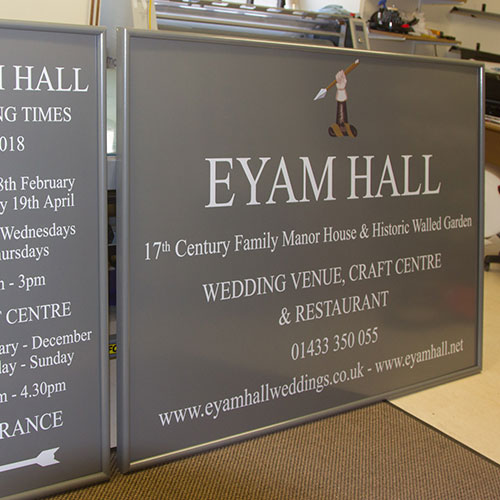
Create a Consistent Colour Palette
Colour is one of the simplest ways to bring an entire signage scheme together.
Rather than choosing each sign individually, establish a small palette of colours that can be repeated throughout the site. This might include:
- A primary background colour
- A contrasting colour for lettering
- One or two accent colours taken from your branding
- A consistent finish for posts, frames and other fittings
This doesn't mean every sign needs to look identical. A large entrance sign and a small directional arrow naturally have very different purposes, but repeating the same colours and design details helps them feel connected.
Contrast is also important. Directional and information signage needs to be easy to read, so there should always be sufficient contrast between the lettering and its background.
Choose Fonts Carefully
Typography has a surprisingly large impact on how professional a signage scheme feels.
Using too many different typefaces can quickly make signage appear inconsistent. Ideally, choose one main font or a small family of complementary fonts and use them throughout the scheme.
Most importantly, consider legibility.
Decorative fonts can look beautiful on a main entrance sign but may be much harder to read on a directional sign that somebody needs to understand quickly.
A successful scheme can therefore establish a hierarchy – perhaps using a characterful font for headings and branding, alongside a clean, highly legible font for directions and practical information.
|
|
|
|
Get the Size Right
Choosing the right size is just as important as choosing the right colours, materials and fonts. A sign may look perfectly proportioned when viewed up close, but if it needs to be read from a vehicle or from further away, the lettering needs to be large enough to remain clear and legible.
Start by considering where the sign will be positioned and how far away people will be when they need to read it. An entrance sign beside a road, for example, will need very different proportions from a small information plaque beside a footpath.
As a useful rule of thumb, you can divide the viewing distance in metres by 0.4 to estimate an appropriate letter height in millimetres, although the font and style of lettering will also affect readability.
We've created a handy Sign Sizes and Letter Heights Guide to help you work out suitable lettering and overall sign dimensions for different viewing distances. Take a look at our Sign Size Guide
And if you're still unsure, don't worry – our designers can help recommend suitable dimensions while making sure there is enough space around the wording to create a balanced, professional-looking sign.
Consider the Materials
The materials you choose can help reinforce the character of your business.
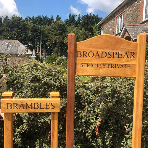
Natural materials such as Oak, Iroko, slate and stone can work beautifully for country estates, holiday accommodation, wedding venues, farms and rural businesses.
For a more contemporary appearance, materials such as aluminium, aluminium composite, acrylic and Corian® can create a clean and modern finish.
You don't necessarily have to use one material throughout an entire site either.
A scheme might combine a substantial timber entrance sign with smaller aluminium directional signs, for example. Consistent colours, typography and design details can tie different materials together.
Material choice should also take into account where each sign will be positioned, its exposure to the weather, maintenance requirements and how long it is expected to remain in place.
|
|
|
|
Get the Size Right
Choosing the right size is just as important as choosing the right colours, materials and fonts. A sign may look perfectly proportioned when viewed up close, but if it needs to be read from a vehicle or from further away, the lettering needs to be large enough to remain clear and legible.
Start by considering where the sign will be positioned and how far away people will be when they need to read it. An entrance sign beside a road, for example, will need very different proportions from a small information plaque beside a footpath.
As a useful rule of thumb, you can divide the viewing distance in metres by 0.4 to estimate an appropriate letter height in millimetres, although the font and style of lettering will also affect readability.
We've created a handy Sign Sizes and Letter Heights Guide to help you work out suitable lettering and overall sign dimensions for different viewing distances. Take a look at our Sign Size Guide
And if you're still unsure, don't worry – our designers can help recommend suitable dimensions while making sure there is enough space around the wording to create a balanced, professional-looking sign.
Think About the Entire Visitor Journey
One of the most useful ways to plan a signage scheme is to imagine that you have never visited the site before.
Start at the road entrance and physically work your way through the location.
Where would you naturally look for a sign?
Where could you become unsure which direction to take?
What information would you need at each stage?
This can help identify signs that may otherwise be overlooked.
A typical scheme could include a main entrance sign, directional signs, parking signs, reception signage, building identification, door signs, information boards, safety notices and smaller wayfinding signs.
Thinking about signage as a complete journey rather than a collection of individual products usually creates a much more professional result.
|
|
|
|
Establish a Clear Hierarchy
Not every sign needs to shout for attention.
The most successful signage schemes have a clear visual hierarchy.
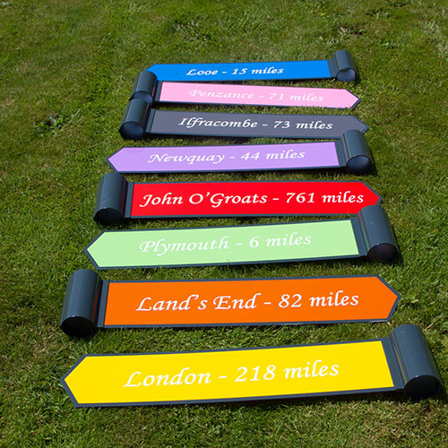
Your main entrance sign might be the largest and most visually impressive sign on the site. Primary directional signs need to be highly visible and easy to understand, while smaller information signs can be much more understated.
Consider what somebody needs to notice first, second and third.
This is particularly important on larger estates and sites where displaying too much information at once can actually make navigation more difficult.
Keep Directional Signage Simple
When somebody is driving or walking through an unfamiliar site, they usually only have a few seconds to process a sign.
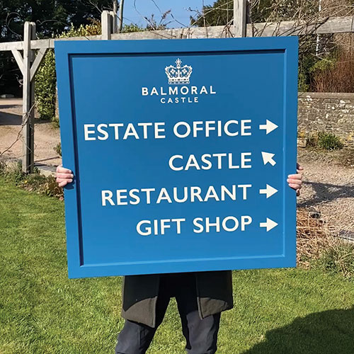
Directional signs therefore benefit from simplicity.
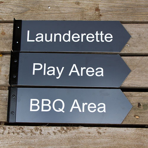
Keep wording concise, use clear arrows and avoid overcrowding the design. Where several destinations need to be listed, think carefully about their order and how information can be grouped.
A beautifully designed sign isn't particularly useful if visitors have to stop and study it to work out where they need to go.
Create a Signage Style Guide
If your site is likely to grow or change over time, creating a simple signage style guide can be extremely useful.
This doesn't need to be complicated. It could simply record your agreed:
Colours | Fonts | Logo positioning | Materials | Lettering styles | Arrow styles | Post colours | Standard sign shapes
When another sign is required six months or five years later, you have a reference point to work from.
This is particularly useful for estates, holiday parks, schools, attractions and businesses with multiple buildings where signage is often added gradually.
A Designer's Perspective
Our designer's advice on creating a successful signage scheme:
‘As well as using signage to introduce or reinforce brand and personality, think space. Signs that are filled can quickly become a roadblock - confusing and hindering rather than helping. Visual communication always needs space for your message to breathe - nowhere more so than in signage where clarity and instant comprehension are key. When designing your signs, leave space around edges and space between sentences or directions. Think how your visitor's eye will follow the flow and give the space and visual cues to guide them. ‘
Don't Forget the Surroundings
A professional signage scheme shouldn't just complement your brand – it should complement the location too.
A highly polished contemporary sign might look fantastic outside a modern office building but completely out of place at the entrance to a historic country estate.
Think about the architecture, landscape, existing buildings and surrounding materials.
Sometimes the best signage doesn't demand attention. Instead, it feels as though it has always belonged there.
Plan for the Future
If you're investing in a complete signage scheme, consider what could change over the next few years.
Will additional businesses move onto the site? Could new accommodation be added? Are departments likely to change? Will you need additional directional arrows?
Where changes are likely, signs can sometimes be designed with future flexibility in mind.
For example, a fingerpost system can allow additional directional fingers to be incorporated later, while modular directory boards can make future updates easier.
Bringing the Whole Scheme Together
Creating professional signage across a business or estate doesn't mean making every sign identical.
It's about creating visual consistency.
The same colours appear repeatedly. Fonts are recognisable. Materials complement one another. Directional signs follow the same format. Information is presented clearly. Every sign feels like part of the same place.
At The Sign Maker, we manufacture bespoke signage for businesses, estates, farms, visitor attractions, holiday destinations and organisations across the UK.
With a wide range of materials and manufacturing methods available, we can create everything from impressive entrance signage and traditional timber fingerposts to information boards, wayfinding signs and smaller identification signage.
Our in-house designers can also help bring the different elements together, helping you develop a signage scheme that is practical, consistent and completely individual to your business.
Planning a new signage scheme? Get in touch with our team to discuss your site, branding and ideas.
Categories
Business Signs
Published by The Sign Maker
Our craftsmen make a huge range of signs, wheel covers, memorial plaques. printed canvas and personalised gifts. Give us a call - I am sure we can help.